The population-centroid is where the people aren’t. The distance from it to them is not zero.
No new Julia packages used.
New Logjam functions used
dgca: Area-adjusted great-circle distance matrix between new-facility/point set X and demand-point set Xa, floored by the mean centroid-to-random-point distance of a disk of area aⱼ.
Every location problem so far has taken its existing facilities as given: a set of points, each with a weight. Where those points come from has not been asked. This lecture asks it, and the answer turns out to determine both what data can be obtained and what has to be done to the distances computed from it.
Demand data comes in two kinds, and which kind a problem has determines everything that follows. Sometimes the demand is actual: the location of each customer is known, along with how much that customer bought. A company asking for its supply chain to be reviewed will send a spreadsheet of its thousand customers and last year’s demand for each, and the problem can be solved exactly as posed. Sometimes no such record exists, because the product was bought not by identifiable customers but by the general population. Demand is then population-inferred: it is assumed proportional to how people are dispersed across the region of interest, which is a reasonable assumption for any retail operation and the only one available.
The difference between the two is visible at a glance, and it is why the choice cannot be made casually. Plot the U.S. cities of at least ten thousand people and the result maps the country’s population: dense on both coasts, fairly even across the Midwest. Plot the country’s foundries instead and the picture is quite different, with very little in the South, little in the West beyond a strip of the coast, and a heavy concentration in the Great Lakes. Foundries are far more clustered than people are. So a problem whose customers are foundries must not be solved on population data; it needs the foundry locations themselves. Also, the customers of the foundries are likely to be other manufacturing and production facilities that have their own unique clustering, depending on the industry. Getting foundry data and each foundry’s customers’ data is the difficulty. This data is not typically public; for example, a project locating additive-manufacturing hubs to serve foundries had to purchase the data shown in Fig. 2.
Show the code that draws this map
# Demand CLASS is the hue. Both are chosen to read against the state# borders at dot size; a dark hue does not.actual = colorant"#0f9aa8"# actual demandinferred = colorant"#c4342b"# population-inferred demand# `makemap`'s road layer is the FAF5 INTERSTATE skeleton: the right# background for a national map, too sparse for a metropolitan one, where# `plotroads!` draws the full network. The boundary is a DISTANCE, about# 150 miles across. Logjam's own thresholds are in degrees of latitude --# 30 to draw roads at all, tiers at 20 and 10 -- and the finest is near# 690 miles, far too coarse to make this call: North Carolina is 489# miles across and does not want the dense network.const CLOSE =150.0# milesfunctionextent(lon, lat) # larger of NS and EW, in miles x0, x1 =extrema(lon); y0, y1 =extrema(lat) xm, ym = (x0 + x1) /2, (y0 + y1) /2returnmax(dgc([xm, y0], [xm, y1]), dgc([x0, ym], [x1, ym]))endfunctiondotmap(lon, lat, title; color = inferred, dot =4.0, w =700, h =400, region =nothing) close =extent(lon, lat) <= CLOSE fig, ax =isnothing(region) ?makemap(lon, lat; xexpand =0.02, yexpand =0.02, doRoadbkgd = !close) :makemap(; region = region)if close# Same hue as makemap's own roads, so the two layers look alike.for (k, v) inplotroads!(ax, faf5nodes(), faf5links()) v.color = (:steelblue,startswith(String(k), "casing") ? 0.12:0.45)endendscatter!(ax, lon, lat; markersize = dot, color = color) ax.title = title ax.titlesize =15resize!(fig, w, h)return figendcus(df) =filter(r -> r.ISCUS && r.POP >0, df)p10 =filter(r -> r.POP >=10_000, cus(usplace()))dotmap(p10.LON, p10.LAT, "$(nrow(p10)) cities with 10K+ population"; dot =2.6, region =:CUS)
Figure 1: Population-inferred demand. Every place of at least ten thousand people in the continental U.S., which is what a retail problem has instead of a customer list.
Figure 2: Actual demand. Every U.S. foundry, located by the ZIP code of its plant. The concentration in the Great Lakes and the Ohio Valley is the industry’s, not the country’s.
Fig. 1 and Fig. 2 are those two pictures, and the contrast between them is the whole argument of this section.
Where the demand really is the general population, the data problem is much the easier one. The U.S. Census Bureau publishes far more of it than any single study can use, it is free, and Logjam already carries the tables, so a data source that would otherwise mean downloading and reconciling government spreadsheets is one function call. Section 3 surveys what is available and how to choose among it.
The convenience comes at a price, and paying it is the theoretical business of this lecture. Population data does not record households; the finest public resolution aggregates them. Each data point therefore stands for a whole region rather than for a customer, and a region cannot be served at its own center.
Locating a new facility at a region’s center of population does not reduce the travel distance to that population to zero. The great-circle distance computed from the aggregate point to itself is zero, and taking that at face value asserts that the whole region can be served at no transport cost. A distribution center off U.S. 70 near Garner does not serve Raleigh for nothing: the vans run, and the miles they cover are real. Treating the distance as zero does not slightly understate that cost, it discards it. What is needed instead is an estimate of the average distance from the center of a region to the population spread across it, and the assumption that makes such an estimate possible is that the population is spread uniformly over the region. That assumption is good enough for the purpose, and everything the rest of this lecture computes rests on it.
2. U.S. statistical geography
Census hierarchy
Every data source in the next section is one of a small number of things the federal government defines, and they are arranged in a hierarchy. Knowing the hierarchy is what makes the choice in Sec. 3 a choice rather than a guess.
The largest unit is the combined statistical area, or CSA.1 The Raleigh-Durham-Cary CSA is one, and it divides a step below into two metropolitan statistical areas, Durham-Chapel Hill and Raleigh-Cary. That division is one the data itself makes obvious: the airport and the thin population between the two halves show up in almost any analysis of the region.
Underneath, all of it is built on counties. Each of North Carolina’s hundred counties either belongs to a combined statistical area or stands alone as a county, and there is nothing in between: no county is partly in, and none is left out.
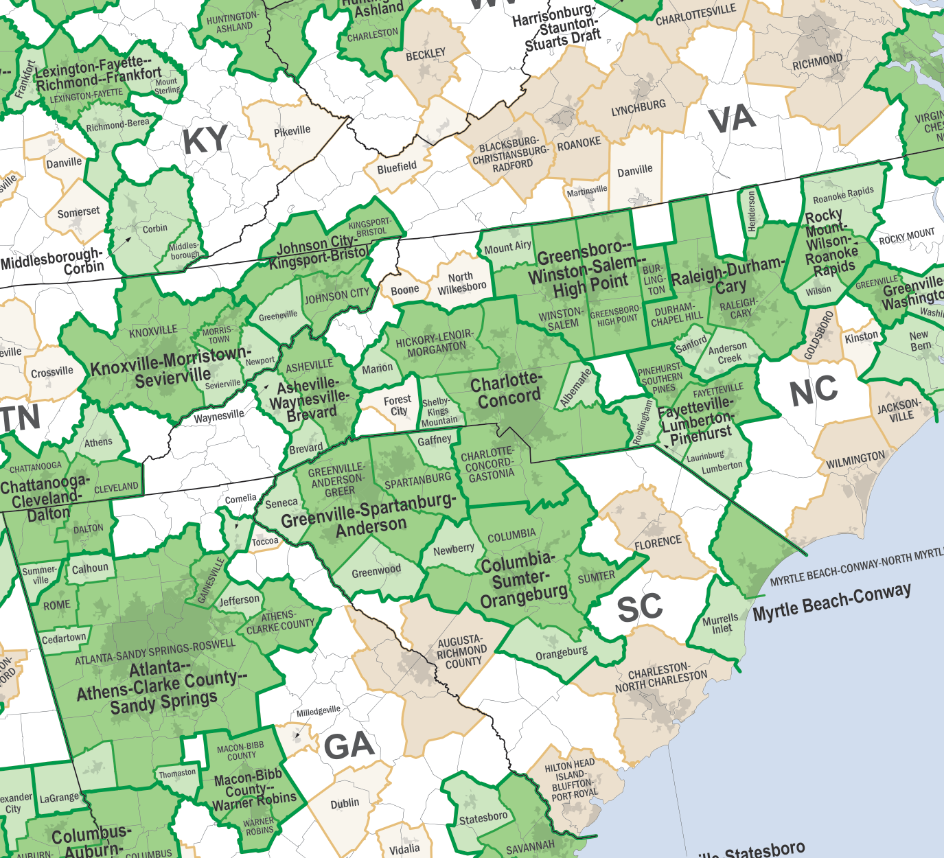
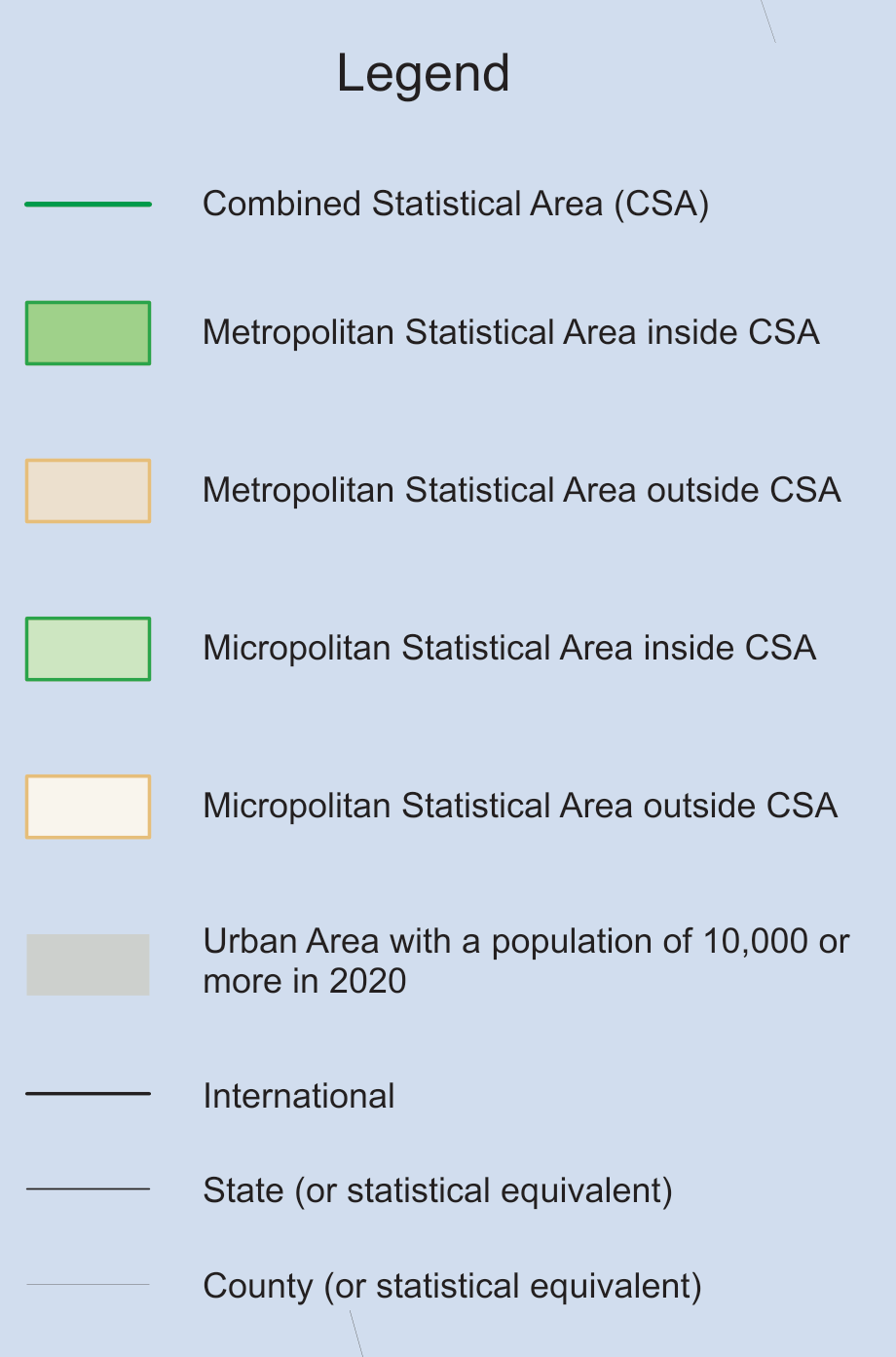
Fig. 3 (a) is that hierarchy as the Census Bureau draws it, over the Carolinas and their neighbors, and Fig. 3 (b) is the key to it. The heavy green outlines are combined statistical areas, the darker green fills inside them the metropolitan areas they are built from, and the tan and cream areas are metropolitan and micropolitan areas that belong to no CSA. County lines are visible throughout, which is the point of the previous paragraph: every one of these boundaries follows them.
Two things on Fig. 3 are worth finding before reading on. Raleigh-Durham-Cary, just right of center, is the CSA Sec. 8 builds a demand set from, and its two constituent metropolitan areas can be made out inside it. And Charlotte-Concord straddles the state line, which is the first hint that these units are drawn to economic geography rather than political.
(a) Combined and metropolitan statistical areas in the Carolinas, Georgia and east Tennessee.
(b) Legend.
Figure 3: Census Bureau combined statistical area wall map.2
A county subdivides into census tracts, a tract into block groups, and a block group into blocks. The chain runs CSA, CBSA, county, tract, block group, block, and each level partitions the one above it.
That partitioning is the property the rest of the lecture depends on. A set of regions that covers an area exactly once, with no gaps and no overlaps, can stand in for the population without losing any of it; a set that does not, cannot. Census geography is built to have this property at every level, which is what makes it usable as demand data at all.
The blocks are the exception worth knowing. A block is the finest unit published, about 500 people, but the Census does not publish an area for one, and an aggregate demand point needs an area. The block group, about 1,500 people, is therefore the finest resolution carrying all three of the fields Sec. 4 requires.
FIPS codes are the key that runs through every level. The five-digit county code is the two-digit state code followed by the three-digit county code, so Wake County, North Carolina is
Tracts and block groups extend the same code to the right, which is what lets one table be joined to another.
Five-digit ZIP codes appear in this hierarchy under a different name. A ZIP code is a postal delivery route rather than an area, so the Census publishes ZIP Code Tabulation Areas, ZCTAs, built to approximate them.
City data: only used for labeling!
A city’s boundary is a legal artifact of annexation history, so its population says as much about that history as about where people live. Atlanta and Jacksonville illustrate why city data should not be used to represent aggregate demand.
The data source does not call it city data. The table is places, because many of the entities in it are not cities: towns, villages and census-designated places too small to be incorporated as one.
Consider locating a single store in Georgia. A ranking of U.S. cities by population is consulted, Georgia appears nowhere near the top of it, and the state is set aside as rural. Atlanta’s city limits hold under half a million people, fewer than Memphis, because a mile from downtown Atlanta the county has already changed: several counties converge within a few miles of the center, and the city proper never grew to cover them. Jacksonville is the mirror image. Florida consolidated the city with the whole of Duval County, so everyone in the county counts as living in the city, and Jacksonville ranks among the largest cities in the country while its metropolitan area does not. The equivalent would be declaring all of Wake County to be Raleigh.
The two cases can be checked directly, and the arithmetic is the argument.
# Code block 1: two cities against the metropolitan areas they namepl, cs =usplace(), uscsa()pop(df, s) =maximum(filter(r ->occursin(s, r.NAME), df).POP)prt(DataFrame(place = ["Atlanta", "Jacksonville"], city = [pop(pl, "Atlanta"), pop(pl, "Jacksonville")], metro = [pop(cs, "Atlanta"), pop(cs, "Jacksonville")]))
place city metro
──────────────────────────────────
Atlanta 498,715 6,976,171
Jacksonville 949,611 1,733,937
Atlanta’s metropolitan area holds fourteen times its city population; Jacksonville’s holds less than twice. The same field means something different in the two rows, which is what disqualifies it: a weight is useful only if it means the same thing everywhere it is used. Neither figure is wrong, and both answer a question about municipal boundaries rather than about where demand is.
So city data is for labeling and not for weighting. A map marked with three-digit ZIP codes tells a reader nothing, and the same map marked with city names is legible at a glance, which is a real use and the one this course makes of it.
If nothing else from this lecture survives, this should: city data is for labeling. The rule is stated that strongly because it is routinely broken, and because it was broken earlier in this course on purpose. Lectures 2.2 and 2.3 weighted North and South Carolina places by population and located against them, which was the right call then: the point of those lectures was the objective and the search, and a demand set that needed no explanation kept them out of the way. From here on the demand set is the subject, and the shortcut has to go. Cities carry a name, which no census unit does, and that is the whole of what they are good for.
The deeper reason is the one this section opened with. Cities do not partition anything: they are islands in a country that is mostly not inside any of them, so a set of cities leaves out everyone in between, and adding more of them does not fix that. Census units partition; cities do not. A city’s published coordinate is also an interior point of its boundary rather than its center of population, which fails the other half of what Sec. 4 requires.
The remedy is the subject of the next section and needs no special handling: at three-digit ZIP resolution Atlanta simply has more demand points than Jacksonville does, and the disparity represents itself.
3. Choosing a resolution
The units of Sec. 2 form a hierarchy, and every unit is a usable demand set for some problem. Choosing among them is the decision this lecture exists to teach, and it is genuinely a decision: there is no resolution that is right in general.
Every count below is measured rather than quoted, which matters because these figures move with each census.
# Code block 2: how many demand points each source yieldsOFF = [2, 15, 60, 66, 69, 72, 78] # non-continental state FIPScus(df) ="ISCUS"innames(df) ? filter(r -> r.ISCUS, df) :filter(r -> !(r.STFIP in OFF), df)src = [("places", usplace()), ("3-digit ZCTA", uszcta3()), ("county", uscounty()), ("5-digit ZCTA", uszcta5()), ("census tract", uscentract()), ("block group", uscenblkgrp())]prt(DataFrame(source =first.(src), continental = [nrow(cus(d)) for (_, d) in src]))
source continental
───────────────────────────
places 31,099
3-digit ZCTA 882
county 3,108
5-digit ZCTA 33,300
census tract 83,239
block group 238,193
Two further levels group the counties rather than subdividing them: there are 918 core-based statistical areas and 180 combined statistical areas.
The tables are not uniform, and the filter above is where that shows. Some carry an ISCUS flag marking a row as continental and some do not, so restricting to the continental United States takes the flag where it exists and a state-code exclusion where it does not. Reconciling differences of exactly this kind is what Sec. 7 is about.
A demand set has to be fine enough that the answer is about the demand rather than about the grid it was measured on. The rule of thumb is at least ten times as many demand points as facilities to be located, so a hundred points is minimum coverage for ten facilities. That is a minimum and not a target, and a little more is better where it is available.
A second rule of thumb sits on top of the first and is easier to remember: about a thousand demand points is more than enough resolution for most problems. It is a useful number because two common cases land near it. The continental United States has 882 three-digit ZCTAs, so one source covers the whole country at about the right grain. And a single metro area reaches the same order at the finest resolution published: the Raleigh-Durham-Cary CSA holds about fourteen hundred block groups.
For some problems the ten-times rule involves a circularity: if the problem is to determine how many facilities to locate, the count the rule needs is the answer being sought. It is a rule of thumb rather than a constraint, so where more data is available, erring on the side of more usually does no harm.
Counties look like a good source and are not, which is worth saying because the count is inviting: about three thousand nationally, a hundred in North Carolina, right in the range the rule of thumb asks for. The trouble is the distribution rather than the number. A county in the middle of Wyoming may hold twenty people, and a county containing a large city holds millions, so the population per unit swings by orders of magnitude across a set that looks uniform on a map. ZIP codes and census-related data do not behave that way: each holds roughly the same number of people, which is what makes them representative of dispersion where counties are not.
What county data is for is reaching the statistical areas. A CSA is defined as a set of counties, so the county table is the route from a metropolitan area to the finer data underneath it, which is exactly how Sec. 8 uses it.
The other constraint runs the other way
Everything above sets a floor. There is also a ceiling, and it comes from the method rather than from the data: a demand set has to be small enough that the problem can actually be solved.
The two constraints are in tension, and which one binds depends on what is going to be run.
With the heuristics of Lecture 2.4 the ceiling is high and forgiving: erring toward too much data costs running time and nothing else. A mixed-integer linear program is the opposite, and the difference is not a matter of degree. A hundred demand points might solve in a minute; a hundred and twenty can take twenty. The growth is not linear, so a set that is comfortably solvable does not warn that the next increment is not, and a demand set chosen purely for fidelity can put a problem out of reach.
So the rule of a thousand points is a fidelity statement, and it is the right one when the method tolerates it. When the method is a MILP the binding constraint is tractability instead, and the resolution has to come down to meet it. Lecture 2.7 takes up mixed-integer formulations and the choice of scale that goes with them; this lecture supplies the data and the vocabulary for that choice.
What each resolution looks like
Four sources, drawn on the same base, at the scale each one is used at. Fig. 4 and Fig. 5 cover the same ground with roughly the same number of points and are not interchangeable: the cities leave the interior west and the northern plains almost empty, because that is where people are not, while the ZIP codes tile the country whether anyone lives there or not. That difference is the one Sec. 2 raised about place data, seen at national scale.
Show the code that draws this map
p50 =filter(r -> r.POP >=50_000, cus(usplace()))dotmap(p50.LON, p50.LAT, "$(nrow(p50)) cities with 50K+ population"; region =:CUS)
Figure 4: Cities of 50,000 or more. The count is close to the three-digit ZIP count, and the coverage is not.
Show the code that draws this map
z3 =filter(r -> r.ISCUS && r.POP >0, uszcta3())dotmap(z3.LON, z3.LAT, "$(nrow(z3)) 3-digit ZIP codes"; region =:CUS)
Figure 5: Three-digit ZIP codes. About nine hundred points covering the whole country, which is the source the rule of thumb points at.
Fig. 6 and Fig. 7 are the same idea one and two levels finer, and each is about a thousand points over a much smaller area. Both show what the rule of thumb means in practice: a thousand points is a state at ZIP resolution, or a single metropolitan area at the finest resolution published.
Show the code that draws this map
znc =filter(r ->27_000<= r.ZCTA5 <=28_999, uszcta5())dotmap(znc.LON, znc.LAT,"$(nrow(znc)) 5-digit ZIP codes in North Carolina"; h =340)
Figure 6: Five-digit ZIP codes in North Carolina. One state, about the same point count as the whole country at three digits.
Show the code that draws this map
csa5 =filter(r ->startswith(r.NAME, "Ral"), uscsa())cbsa5 =filter(r -> !ismissing(r.CSA) && r.CSA in csa5.CSA, uscbsa())co5 =filter(r -> !ismissing(r.CBSA) && r.CBSA in cbsa5.CBSA, uscounty())bg5 =filter(r -> r.STFIP in co5.STFIP && r.COFIP in co5.COFIP,uscenblkgrp())dotmap(bg5.LON, bg5.LAT, "$(nrow(bg5)) block groups, Raleigh CSA"; dot =3.4, w =560, h =500)
Figure 7: Census block groups in the Raleigh CSA. The finest public resolution, and at this scale the clusters are recognizably Raleigh, Cary, Durham and Chapel Hill.
What comes down is not the region and not the fidelity of the underlying census data, but the number of points the model sees. That is an aggregation problem in its own right, and it is the subject of Sec. 4: the same three-digit ZCTAs can be grouped into two-digit ones, taking the continental United States from 882 demand points to fewer than a hundred without leaving the census data or changing the region.
Example 1: Demand points for North Carolina
Determine how many demand points each census source yields for one state, and where the population-weighted minisum optimum falls at the finest resolution available.
Example 1(a): What each source yields
Determine the number of demand points each of the six census sources provides for North Carolina.
One state makes the hierarchy concrete, because the counts differ by three orders of magnitude over the same ground.
source points
──────────────────────
places 776
3-digit ZCTA 20
county 100
5-digit ZCTA 853
census tract 2,655
block group 7,111
The two ZCTA rows are selected differently from the other four, and the reason is a property of the data rather than of the state. Places, counties, tracts and block groups all carry a state FIPS code, so a state is one comparison. The ZCTA tables carry no state field at all, so the selection is by ZIP prefix instead: North Carolina’s are 270 through 289. That is an approximation at the state line and an exact answer nowhere, which is worth knowing before either count is quoted.
Example 1(b): The optimum at the finest resolution
Determine the population-weighted minisum location for North Carolina using every census block group as a demand point.
With the demand points chosen, the single-facility minisum of Lecture 2.2 runs unchanged. The weights are block-group populations, the distances are great-circle, and the search starts from the weighted centroid.
# Code block 4: minisum over every North Carolina block groupbg =filter(r -> r.STFIP == NC, uscenblkgrp())pt =eachrow(hcat(bg.LON, bg.LAT))TC(xy) =sum(bg.POP .*dgc.([xy], pt))w =wcentroid(bg.LON, bg.LAT, bg.POP)xᵒ =optimize(TC, [w.LON, w.LAT]).minimizer
# Code block 5: how many points, how many people, and whereprt(DataFrame(points =nrow(bg), population =sum(bg.POP), nearest =lonlat2loc(xᵒ, usplace()).desc))
points population nearest
───────────────────────────────────────────────────
7,111 10,439,388 6.6 mi S of Franklinville, NC
7,111 block groups carrying 10,439,388 people put the optimum at 6.6 mi S of Franklinville, NC.
The answer is reported as a place name rather than a coordinate, which is the one use city data is for. Nothing in the calculation used it.
And the answer can be checked against one already known. Lecture 2.2 solved the same objective over North Carolina’s places rather than its block groups and put the optimum near the same village. Two sources, differing by an order of magnitude in resolution and by nearly four million people in coverage, agree to within a fraction of a mile. That is a Triangulate check.
That agreement is the point of the example rather than a curiosity, and it has been checked before on the same ground. Going from under a hundred cities to several thousand aggregate demand points barely moves the answer. The finer set is arguably a little more accurate, and for the size of the increase it is probably not worth the effort.
Which is not the same as saying resolution never matters, and the distinction is what makes the rule usable. For a continuous minisum, a large demand set costs nothing but time and buys almost nothing, so the choice is free. For the discrete problems of Lecture 2.4 and the mixed-integer ones of 2.7, the same extra points are paid for twice over: once in run time, and again in Sec. 6’s area adjustment, which matters most exactly where the demand set is coarse. The resolution decision matters most for what a model can represent, and least for where a single facility lands.
Table 1 puts the six sources and all three scales in one place. Only the three sources that nest in a county can be cut to a CSA at all.
Table 1: Aggregate demand point data sources.
source
continental U.S.
North Carolina
Raleigh CSA
what it is for
places
31,099
776
n/a
labeling only, never demand points
3-digit ZIP
882
20
n/a
no geographic key; ZIP prefix instead
county
3,108
100
10
grouped by state or CBSA
5-digit ZIP
33,300
853
n/a
no geographic key; ZIP prefix instead
census tract
83,239
2,655
490
block group
238,193
7,111
1,381
finest resolution; blocks carry no area
4. Aggregating demand points
Sec. 3 chose how many demand points to use. This section asks what one of them actually is, which turns out to require three fields rather than the two a location problem has needed so far.
An existing facility is a physical place with a weight: a supplier’s plant, with the tonnage it ships in a year. Both are known and neither needs constructing. An aggregate demand point is a single location standing for many demand sources at once: an artifact that has to be constructed, and one that corresponds to no physical place.
Its weight is the easy part, and it is the sum of the weights it replaces. The location is the hard part and is the subject of the rest of this section. And a third field is needed that an existing facility never required: a measure of the region’s extent, a length in one dimension and an area in two, because the demand is assumed spread uniformly over the region rather than concentrated at the point.
=sum of the weights it replaces, in their own units
x_\text{agg}
=single location standing for all of them
a
=extent of the region, a length in one dimension and an area in two.
That third field is why Sec. 2 dwelt on which census units publish an area. It is also why city data fails twice over: a set of cities does not partition the region, and a city’s published coordinate is an interior point rather than a center of population.
Why the centroid
The location is not chosen for looking central. It is chosen by asking what an aggregate point is for, and then solving for the point that does the job.
What it is for is standing in without changing the answer. For any location x a facility might take, the aggregate should give the same weighted distance as the points it replaces:
That is a requirement rather than a definition, and it names no particular point. Solving it is what produces one.
Doing the algebra produces the centroid, and that is the justification for using it: not that it is the obvious middle, but that it is the point the substitution requires. Once it is in hand, a whole region of population can stand at one location and the location analysis proceeds exactly as before, so long as the objective is minimizing the sum of distances.
That claim is checkable on a single instance, and checking it is more convincing than the algebra. Take the seven I-40 cities of Lecture 2.1, measure from an arbitrary point, and total the weighted distances: the answer is 7,860. Now replace all seven by the centroid alone and multiply by the total weight. The answer is 7,860 again, which is what Eq. 2 demanded.
Substitute the median instead and the total comes out lower, and that is the useful half of the demonstration rather than a footnote to it. A smaller number is not a better answer here; it is the wrong answer to a different question. The median minimizes total weighted distance, so of course it gives less. What the aggregate point has to do is reproduce the total, not improve it.
# Code block 6: the aggregate reproduces the total, the median does notmi = [50, 150, 190, 220, 270, 295, 420] # I-40 mile markers, lecture 2.1wi =1:7# illustrative weightsx0 =0# any reference point will doxc =sum(wi .* mi) /sum(wi) # the weighted centroidhalf =sum(wi) /2xm = mi[findfirst(c -> c >= half, cumsum(wi))] # the medianprt(DataFrame(measured_from = ["all seven", "the centroid", "the median"], at =round.([x0, xc, xm], digits =2), total =round.(Int, [sum(wi .*abs.(mi .- x0)),sum(wi) *abs(xc - x0),sum(wi) *abs(xm - x0)])))
measured_from at total
──────────────────────────────
all seven 0.00 7,860
the centroid 280.71 7,860
the median 270.00 7,560
The centroid at mile 280.71 reproduces the total exactly; the median at mile 270 does not.
Two points at 40 and 10 carrying weights 2 and 1 aggregate to (40 \cdot 2 + 10 \cdot 1)/3 = 30, with an aggregate weight of 3, as in Fig. 8.
Show the code that draws this figure
# Roles, per the course palette: weights are the input (red), positions# locate the figure (ink), and the aggregate is the answer (maroon).wc = colorant"#d21f26"; ink = colorant"#252525"; agg = colorant"#b23a48""""A number line from `lo` to `hi`, arrowed at both ends."""functionnumberline(lo, hi; height =210, width =700, fs =15) fig =Figure(size = (width, height)) ax =Axis(fig[1, 1]); hidedecorations!(ax); hidespines!(ax) pad =0.09* (hi - lo)xlims!(ax, lo - pad, hi + pad); ylims!(ax, -1.02, 0.62)lines!(ax, [lo - pad, hi + pad], [0, 0]; color = ink, linewidth =1.6)for (xt, m) in ((lo - pad, :ltriangle), (hi + pad, :rtriangle))scatter!(ax, [xt], [0]; marker = m, markersize =11, color = ink)endreturn fig, ax, fsend"""Tick at `x`: its symbol above, stacked labels below."""functiontick!(ax, x, above, below...; fs =15, color = ink, mark =nothing)lines!(ax, [x, x], [-0.11, 0.11]; color = ink, linewidth =1.4)text!(ax, x, 0.30; text = above, fontsize = fs, color = color, align = (:center, :bottom))if mark !==nothingscatter!(ax, [x], [0]; marker =:circle, markersize =19, color =:white, strokecolor = wc, strokewidth =1.6)text!(ax, x, 0.0; text = mark, fontsize = fs -3, color = wc, align = (:center, :center))end# Row 2 is the weight and takes the accent; a coordinate never does.for (k, s) inenumerate(below)text!(ax, x, -0.20-0.30* (k -1); text = s, fontsize = fs, color = k ==2 ? (color === ink ? wc : color) : ink, align = (:center, :top))endendx1, w1, x2, w2 =10, 1, 40, 2xagg = (x1 * w1 + x2 * w2) / (w1 + w2)fig, ax, fs =numberline(0, 40)tick!(ax, 0, L"x", "0"; fs = fs)tick!(ax, x1, L"x_1", "$x1", L"w_1 = 1", "Durham"; fs = fs, mark ="1")tick!(ax, x2, L"x_2", "$x2", L"w_2 = 2", "Raleigh"; fs = fs, mark ="2")tick!(ax, xagg, L"x_\mathrm{agg}", "$(Int(xagg))", L"w_\mathrm{agg} = 3"; fs = fs, color = agg)fig
Figure 8: Two existing facilities and the single point that replaces them. The aggregate sits at the weighted centroid, nearer Raleigh because Raleigh carries twice the weight.
The qualification is the interesting half
The condition attached to that result is not decoration. The centroid is the right aggregate location because the objective is linear in distance, and it stops being right the moment the objective is not.
Squared distance is the case the course has already met. Under a squared objective the substitution of Eq. 2 does not hold exactly: collapsing a cluster to its centroid leaves a residual term that depends on how spread out the cluster was, which is precisely the information the collapse discarded. So the centroid is not a universal representative. It is the representative for minisum.
This is the fifth time the course has met one identity, and naming the earlier four is worth more than repeating the derivation:
Lecture 1.1 introduced the mean beside the median, and the property that the mean is what scales.
Lecture 2.2 used the weighted centroid as the starting point for its numerical search.
Lecture 2.4 met it again in an unexpected place: fitting production cost by least squares, where the residuals of an L2 fit sum to zero, which is what lets a fitted total be substituted for the data without disturbing the total.
That last one is the same property as this section’s, stated in the language of regression rather than of geography. An aggregate demand point has to preserve the total it stands for, or every cost computed from it is wrong; residuals summing to zero is that preservation; and the point at which it holds is the weighted centroid. Lecture 2.1 puts it in one line: equalize-the-burden, center of gravity, arithmetic mean, and least squares are four names for one balance condition.
Example 2: Two-digit ZCTA demand set
Determine an aggregate demand set for the continental United States at two-digit ZIP resolution, by grouping the three-digit ZCTAs and computing the weight, location and extent of each group.
Sec. 3 gave the reason to want this: at three-digit resolution the continental United States has about nine hundred demand points, which is comfortable for a heuristic and too many for a mixed-integer program. Grouping them by their first two digits reduces the count by roughly an order of magnitude without leaving the census data or changing the region covered.
The construction is the definition of Eq. 1, applied to every group.
# Code block 7: group the three-digit ZCTAs by their first two digitsz =filter(r -> r.ISCUS, uszcta3())# `÷` is integer division, the floor of the quotient: 274 ÷ 10 = 27.# Dividing by 10 and dropping the remainder is what removes the last# digit, leaving the two-digit prefix that names the group.z.ZCTA2 = z.ZCTA3 .÷10# `groupby` splits one frame into one per distinct key, the operation# SQL spells GROUP BY. Sec. 7 takes up the split-apply-combine idiom# it belongs to.g =groupby(z, :ZCTA2)
GroupedDataFrame with 98 groups based on key: ZCTA2
First Group (10 rows): ZCTA2 = 1
Row
ZCTA3
LON
LAT
POP
ALAND
AWATER
ISCUS
ZCTA2
Int64
Float64
Float64
Int64
Float64
Float64
Bool
Int64
1
10
-72.5732
42.2125
472839
1276.13
38.492
true
1
2
11
-72.5504
42.1064
171760
40.946
1.716
true
1
3
12
-73.2286
42.4562
128186
902.054
16.827
true
1
4
13
-72.4882
42.589
82872
786.428
27.535
true
1
5
14
-71.7824
42.5801
224307
474.268
14.954
true
1
6
15
-71.7974
42.2158
398528
796.701
34.589
true
1
7
16
-71.81
42.2679
214258
56.688
2.064
true
1
8
17
-71.4539
42.328
412856
377.368
14.444
true
1
9
18
-71.2041
42.6359
779194
393.493
16.015
true
1
10
19
-70.908
42.5725
510471
343.031
54.709
true
1
⋮
Last Group (5 rows): ZCTA2 = 99
Row
ZCTA3
LON
LAT
POP
ALAND
AWATER
ISCUS
ZCTA2
Int64
Float64
Float64
Int64
Float64
Float64
Bool
Int64
1
990
-117.373
47.6799
168691
2223.12
26.286
true
99
2
991
-117.709
47.6773
121014
11778.0
232.138
true
99
3
992
-117.374
47.6847
385114
336.764
1.33
true
99
4
993
-119.044
46.2929
404636
7537.07
155.382
true
99
5
994
-117.295
46.3593
22324
664.871
4.416
true
99
Each group’s weight is a sum, and so is its extent. Its location is the population-weighted centroid, which Logjam supplies: wcentroid weights longitude by the cosine of latitude, so that a degree of longitude counts for the distance it actually spans rather than for a degree.
# Code block 8: weight, location and extent of every groupz2 =combine(g, [:LON, :LAT, :POP] => ((x, y, w) ->wcentroid(x, y, w).LON) =>:LON, [:LON, :LAT, :POP] => ((x, y, w) ->wcentroid(x, y, w).LAT) =>:LAT,:POP => sum =>:POP, :ALAND => sum =>:ALAND)prt(first(z2, 5))
# Code block 9: what the aggregation cost, and what it preservedprt(DataFrame(level = ["3-digit", "2-digit"], points = [nrow(z), nrow(z2)], population = [sum(z.POP), sum(z2.POP)], area =round.([sum(z.ALAND), sum(z2.ALAND)])))
level points population area
─────────────────────────────────────────
3-digit 882 329,253,476 2,611,660
2-digit 98 329,253,476 2,611,660
882 three-digit ZCTAs become 98 two-digit ones, carrying the same population and the same land area.
The last row is a check and not a formality. An aggregation that changes the total it aggregates is wrong by definition, so the population and area columns must agree exactly between the two rows. That is a Balance check, and it is the mechanical form of Sec. 4’s argument for the centroid: the aggregate has to preserve what it replaces.
Note what the check does not cover. The populations agree because a sum of sums is a sum; the locations are not verifiable this way, and neither is the distance error introduced by collapsing each group to a point. That error is what Sec. 5 quantifies.
5. Average distance within a region
Sec. 4 placed the aggregate point. This section answers the question the placement leaves open, which is the one Sec. 1 opened the lecture with: how far is a facility from a region it is standing on?
The answer cannot be zero, and the reason is a theorem Lecture 1.1 already proved. Distance is a nonlinear function of position, so the distance to the mean of a set of points is not the mean of the distances to them. That is Jensen’s inequality, and for a convex function the direction is fixed: the value at the mean falls below the mean of the values. Applied here it says the centroid distance always understates, and it says so before any region is examined. Lecture 1.1 states the working rule in general terms, that a mean may stand in for the data when the quantity of interest is linear in it but not when that function is nonlinear, “where the spread of the data itself changes the answer”. The region’s extent is that spread, which is why an aggregate demand point needed a third field at all.
What remains is to compute the gap.
One dimension
The step this section takes is Fig. 9 to Fig. 10. A handful of demand points becomes one aggregate point in the first, exactly as Sec. 4 described, and in the second the points themselves are gone: what remains is the extent they occupied, a region with demand spread along it, standing at its centroid. Everything after this is about the distance from a facility to that region rather than to that point.
Show the code that draws this figure
# The source gives the weights and the left-to-right order but not the# coordinates, and states the centroid is 25. These positions are the ones# that reproduce it; the centroid below is computed, never asserted.xe = [10, 14, 21, 26, 30, 40]we = [1, 3, 1, 2, 4, 2]lbl = ["1", "3", "4", "5", "6", "2"]num = ["10", "", "", "", "", "40"]xc =sum(xe .* we) /sum(we)@assert xc ==25&&sum(we) ==13fig, ax, fs =numberline(0, 40)tick!(ax, 0, L"x", "0"; fs = fs)for (x, w, s, n) inzip(xe, we, lbl, num)tick!(ax, x, L"x_%$s", n, L"w_%$s = %$w"; fs = fs, mark = s)endfig
Figure 9: Six existing facilities on a line, spanning the same interval as the two of Fig. 8. Their weighted centroid is the point that replaces all six.
Show the code that draws this figure
regc = colorant"#f2d64b"# the region itselfdc = colorant"#d21f26"; rc = colorant"#2f7cb0"# the two distancesxb, xt =extrema(xe) # the extent the points occupiedr = (xt - xb) /2# radius: half the segmentxin =20# a facility inside the region# Uniform demand: the centroid is the midpoint of the extent.@assert r ==15&& xc == (xb + xt) /2"""An arrow from `x0` to `x1` at height `y`, labelled above its middle."""functionspan!(ax, x0, x1, y, lab, col; fs =15)lines!(ax, [x0, x1], [y, y]; color = col, linewidth =2.0)scatter!(ax, [x1], [y]; color = col, markersize =12, marker = x1 > x0 ? :rtriangle ::ltriangle)text!(ax, (x0 + x1) /2, y +0.05; text = lab, fontsize = fs, color = col, align = (:center, :bottom))returnnothingend"""Below the line: the coordinate, then the symbol under it."""functionfoot!(ax, x, num, sym; fs =15, color = ink, extra =nothing)lines!(ax, [x, x], [-0.11, 0.11]; color = ink, linewidth =1.4)text!(ax, x, -0.20; text = num, fontsize = fs, color = ink, align = (:center, :top))text!(ax, x, -0.52; text = sym, fontsize = fs, color = color, align = (:center, :top)) extra ===nothing||text!(ax, x, -0.84; text = extra, fontsize = fs, color = color, align = (:center, :top))returnnothingendfig, ax, fs =numberline(0, 40; height =250)ylims!(ax, -1.30, 0.95)poly!(ax, Point2f[(xb, 0.06), (xt, 0.06), (xt, 0.34), (xb, 0.34)]; color = regc, strokecolor = ink, strokewidth =1.2)text!(ax, (xb + xt) /2, 0.20; text ="Line segment region", fontsize = fs, color = ink, align = (:center, :center))span!(ax, xc, xin, 0.58, L"d", dc; fs = fs)span!(ax, xc, xt, 0.58, L"r", rc; fs = fs)# Both spans start at the centroid. A tick at the shared origin keeps the# two readable when colour alone is not.lines!(ax, [xc, xc], [0.51, 0.65]; color = ink, linewidth =1.4)foot!(ax, 0, "0", L"x_\mathrm{out}"; fs = fs)foot!(ax, xb, "$xb", L"x_\mathrm{begin}"; fs = fs)foot!(ax, xin, "$xin", L"x_\mathrm{in}"; fs = fs)foot!(ax, xc, "$(Int(xc))", L"x_\mathrm{agg} = x_\mathrm{centroid}"; fs = fs, color = agg, extra = L"w_\mathrm{agg} = 13")foot!(ax, xt, "$xt", L"x_\mathrm{end}"; fs = fs)fig
Figure 10: The same demand as a region rather than as points. The aggregate sits at the centroid, r is the distance from there to the far end, and d is the distance from there to a facility inside the region.
Take the region to be a line segment. Its aggregate location is the midpoint, and its radiusr is half its length:
d = \left|x - x_\text{centroid}\right|, \qquad
r = \frac{\left|x_\text{end} - x_\text{begin}\right|}{2}
For a facility at distance d from that midpoint, the average distance to the demand spread uniformly along the segment is
d_a =
\begin{cases}
\dfrac{r}{2} + \dfrac{d^{2}}{2r}, & d \le r, \\[2ex]
d, & d > r.
\end{cases}
\tag{3}
The algebra behind the first branch is not the point and is not reproduced. The point is the branch itself: inside the region the distance does not go to zero. At the centroid, where d = 0, it is r/2.
The two branches answer a question the aggregate point alone cannot. For a facility outside the region, the centroid works: the distance to it stands for the distance to everything inside. Put the facility in the region and it stops working. In Fig. 10 the facility at mile 20 is five miles from the aggregate point, and five miles is not the distance to the demand: it is the distance to a point that no longer represents anything, because the demand is spread on both sides of it.
That is what r and d are for. Splitting the segment at its midpoint and measuring to the end gives r, which becomes the radius of a circle in two dimensions; d is the distance from the aggregate point to the facility. The first branch of Eq. 3 is what those two produce, and the extra term beyond r/2 is the distance of actually reaching the whole region rather than its center.
The two branches agree where they meet: at d = r the first gives r/2 + r/2 = r, which is the second. So Eq. 3 is continuous, and the one-dimensional case has no seam.
It is exact at both ends, agreeing with Eq. 3 at d = 0 and at d = r, and it understates in between. The worst case is at d = r/2, where it is 20% low. That is the trade the approximation makes, and it is worth stating as a number rather than as “close enough.”
Example 3: Average distance along a corridor
Determine the aggregate distance from a facility to six demand points represented by a single aggregate point on a corridor, for a facility inside the region and for one outside it.
The six demand points of Fig. 9 lie along a corridor between mile 10 and mile 40, carrying a combined weight of 13. Aggregating them replaces the six by one point, and Fig. 10 is the result: the points gone, the extent they occupied left behind as a region.
The aggregate location is the midpoint of the region, since the demand is assumed spread uniformly across it. Fig. 10 carries all three quantities, x_\text{agg} and w_\text{agg} under the line and r above it:
A facility inside the region, at mile 20, the x_\text{in} of the figure. Here d = |20 - 25| = 5, which is less than r, so the first branch of Eq. 3 applies:
The straight-line distance to the aggregate point is 5 miles. The aggregate distance is 8.33, which is the number that belongs in a transport cost.
A facility outside the region, at mile 0, its x_\text{out}. Here d = |0 - 25| = 25, which exceeds r, so the second branch applies and d_a = 25 mi. Far enough away, the region’s extent stops mattering and the distance to its centroid is the whole story.
A facility standing on the aggregate point. Here d = 0 and
d_a = \frac{15}{2} + 0 = 7.5\ \text{mi},
which is the result the rest of the lecture rests on. Locating on a region’s centroid does not serve it for nothing; it costs 7.5 miles of average travel, and a model that records zero there has discarded the entire cost of serving that region.
At mile 20, d_a = 8.33 mi; at mile 0, d_a = 25 mi; at the centroid itself, d_a = 7.5 mi and not zero.
Two dimensions
A real region is a county or a ZIP code and has whatever shape it has. Every region is therefore replaced by a circle of the same area, which is a further approximation on top of the uniform-demand one and costs little, because nothing else here is exact either. Making this step more accurate would not make the answer more accurate.
The circle’s radius follows from its area,
r = \sqrt{\frac{a}{\pi}},
\tag{5}
and the average distance from its center to a point drawn uniformly from it follows by integration:
\bar d = \frac{2}{3}\,r
\qquad \text{average distance with the facility \textit{at} the centroid.}
\tag{6}
Fig. 11 is the one-dimensional picture with a dimension added, and every symbol keeps its meaning: r still runs from the aggregate point to the edge of the region, and d still runs from the aggregate point to the facility. What changes is that d now has a direction, and by symmetry the answer does not depend on which one.
Show the code that draws this figure
θ =range(0, 2π; length =400)fig =Figure(size = (300, 300))ax =Axis(fig[1, 1]; aspect =DataAspect())hidedecorations!(ax); hidespines!(ax)lines!(ax, cos.(θ), sin.(θ); color = ink, linewidth =1.6)scatter!(ax, [0], [0]; color = ink, markersize =7)span2!(x, y, lab, col) =beginlines!(ax, [0, x], [0, y]; color = col, linewidth =2.4)scatter!(ax, [x], [y]; color = col, markersize =13, marker =:utriangle, rotation =atan(y, x) -π/2)# Label sits OFF its line, offset along the perpendicular, so no# glyph crosses the segment it names. n =15/hypot(x, y)text!(ax, x /2, y /2; text = lab, fontsize =24, color = col, align = (:center, :center), offset = (-y * n, x * n))endspan2!(1.0, 0.0, L"r", rc) # centroid to the edgespan2!(0.52, 0.62, L"d", dc) # centroid to a facilitytext!(ax, -0.55, 0.62; text = L"a", fontsize =26, color = ink)fig
Figure 11: A region of area a replaced by the circle of the same area. r is its radius and d the distance from its center to a facility, exactly as on the line.
NoteDerivation of the two-thirds result
a = \pi r^2 \Rightarrow r = \sqrt{\frac{a}{\pi}}
Total distance centroid to all points (x, y) in a:
and it is Eq. 7 that the code in Sec. 6 runs. It is exact at the centroid and exact far away, and it is what Logjam’s dgca computes.
The two branches are two different questions, and Fig. 12 is where that becomes visible. Demand is the red cloud, spread uniformly over the region. A facility inside the region, anywhere along the blue segment, is surrounded by demand and its average distance is dominated by the region’s own extent rather than by where in the region it stands. A facility outside it, anywhere along the green segment, sees the whole region off in one direction, and the further away it goes the less its own position matters relative to the distance itself. The boundary is where one description gives way to the other.
Show the code that draws this figure
usingRandom# Uniform on the disk needs sqrt on the radius; sampling the radius# uniformly would crowd the center and bias the picture toward it.Random.seed!(754)np =500ρ, φ=sqrt.(rand(np)), 2π .*rand(np)px, py = ρ .*cos.(φ), ρ .*sin.(φ)inc = colorant"#2b4a8a"; outc = colorant"#2fae4f"# inside / outsidefig =Figure(size = (320, 448))ax =Axis(fig[1, 1]; aspect =DataAspect())hidedecorations!(ax); hidespines!(ax)scatter!(ax, px, py; color = dc, markersize =3)lines!(ax, cos.(θ), sin.(θ); color = ink, linewidth =1.6)scatter!(ax, [0], [0]; color = ink, markersize =7)lines!(ax, [0, 0], [0, -1]; color = inc, linewidth =4, linestyle = (:dot, :dense))lines!(ax, [0, 0], [-1, -2.1]; color = outc, linewidth =4, linestyle = (:dot, :dense))text!(ax, 0.18, -0.5; text = L"d < r", fontsize =22, color = inc, align = (:left, :center))text!(ax, 0.18, -1.55; text = L"d > r", fontsize =22, color = outc, align = (:left, :center))text!(ax, -0.55, 0.62; text = L"a", fontsize =26, color = ink, align = (:center, :center))fig
Figure 12: Demand spread uniformly over the region. Inside the region (blue) the average distance is set by the region’s extent; outside it (green) by the distance to the region. The sample is drawn live from a fixed seed.
An empirical estimate, fitted by regression to simulated data
The two results so far answer two different questions. Eq. 6 is the average distance for a facility standing on the centroid, where d = 0, and Eq. 7 approximates every other case by taking the larger of d and that one value. What neither gives is the average distance from a facility at an arbitrary d, which is the quantity a transport cost actually needs. An empirical formula covers the whole range:
d_a =
\begin{cases}
\dfrac{2r}{3} + \dfrac{d}{48} + \dfrac{9d^{2}}{20r}, & d < r, \\[2ex]
d + \dfrac{3r^{2}}{23d}, & \text{otherwise}
\end{cases}
\qquad \text{average distance from } x \text{ to all points.}
\tag{8}
Two lines of arithmetic, with no series and no special function, accurate to a fraction of a percent across the range, and outside the region it keeps d_a > d: a facility beyond a region still pays something for the region’s spread.
In practice Eq. 7 is usually enough, and the reason is the circle. Every region has already been replaced by a circle of the same area, and a ZIP code or a census block group is not circular. That substitution is fairly accurate, which is what makes it acceptable, but it is the binding approximation: refining the distance formula underneath it sharpens a term whose error is not what limits the answer. So Eq. 7 is the engineering choice, which is why it is what Sec. 6 runs and what dgca computes, and Eq. 8 is there for the occasions that warrant it.
Eq. 8 was fitted rather than derived, and the fit came first. The quantity was taken to have no convenient closed form, so it was estimated from simulated data; the exact result was found in the literature only afterwards.3 Checking against it is a Source check, and the only confirmation available: a fit agreeing with its own data is not evidence.
A published exact result is the exception, which is what makes the technique worth more than the formula: most quantities of this kind have none to find, and the technique asks only that the quantity be computable, not integrable. The regression does the estimating; the simulation only supplies observations. Two screens apply to the formulas themselves. On Eq. 5, a Units screen: a/\pi is an area, so r is a length and \tfrac23 r a distance, as the next equation requires. That screen also catches the commonest error here, since \tfrac23\sqrt{a}/\pi is still a length, so the units survive while the value is wrong by a factor of \sqrt{\pi}. On Eq. 6, a Bounds check: the mean distance between two points drawn independently and uniformly from a disk is 128\,r/(45\pi) \approx 0.905\,r,4 and that must bound the centroid-to-point average, where one point is pinned at the center rather than free, so \tfrac23 r \approx 0.667\,r has to be the smaller, and it is.
NoteHow the estimate was fitted
The technique is general: simulation supplies the observations and regression estimates the formula, which is the one to reach for when a quantity can be computed but not integrated. Each step below is followed by the Julia that carries it out.
Step 1. Generate the population. Scatter points uniformly over the region. The simplest way is rejection: draw them in the square that encloses the disk and discard whatever falls outside. Working in units of the radius makes the answer a multiple of r, and the seed makes the whole fit reproducible.
# Code block 10: draw points uniformly over the unit disk by rejectionusingStatisticsRandom.seed!(82734)XY =rand(50_000, 2) .*2.-1# the squareXY = XY[vec(sum(abs2, XY; dims =2)) .<1, :] # keep the disksize(XY, 1) # how many survived
39420
Step 2. Sweep the independent variable. Take a series of facility positions along a line running from the centroid outward, and at each one average the distance to every point. Each position yields one observation: distance from the centroid in, aggregate distance out.
# Code block 11: one observation per facility positiondd =collect(range(0, 1; length =56))da = [mean(dists([x 0], XY, 2)) for x in dd]prt(DataFrame(d =round.(dd[1:4], digits =4), d_agg =round.(da[1:4], digits =4)))
Step 3. Anchor what is already known. At the centroid the answer is exactly \tfrac23 r by Eq. 6, so that value is imposed rather than estimated, leaving one fewer parameter to fit.
da[1] =2/3# Code block 12: the one point that needs no fitting
0.6666666666666666
Step 4. Fit candidate forms and keep the best. A quadratic in d fits the interior. Outside, what is worth fitting is not d_a but its excess over d, since d itself is already most of the answer there. Parameters come from minimizing root mean squared error, and that error is also how the choice among candidate forms is made.
linear quadratic exterior_excess rmse
─────────────────────────────────────────────
1 0.0224 0.4490 0.1328 0.0019
Step 5. Round the coefficients, then re-measure. The fitted decimals become the simple fractions the formula shows, and the error is measured again to see what the tidying cost. Here it costs about a thousandth of a radius, which is a good trade for a formula that can be remembered. Not every coefficient rounds equally well: the quadratic term and the exterior excess land almost exactly on their fractions, while the linear term is the one the data barely constrains, because the curve it is fitting is nearly a pure quadratic.
# Code block 14: price the rounding rather than assume itprt(DataFrame(coefficients = ["least squares", "as fractions"], linear = [round(p[1], digits =4), 1/48], quadratic = [round(p[2], digits =4), 9/20], excess = [round(excess, digits =4), 3/23], rmse =round.([rmse(p), rmse([1/48, 9/20])], digits =5)))
coefficients linear quadratic excess rmse
──────────────────────────────────────────────────
least squares 0.0224 0.4490 0.1328 0.0019
as fractions 0.0208 0.4500 0.1304 0.0019
6. Aggregate demand in a location model
Everything so far has been about a single distance. This section is about what that distance does inside a model. Transport cost is a product: a rate in dollars per mile, times a distance, times a quantity. A zero distance does not make one term of that product small, it blanks the term out entirely, so serving a whole region becomes free, which is never true of a population spread across it.
The failure is confined to discrete problems, which is why it can be overlooked. A continuous search rarely lands exactly on a demand point, so a zero distance almost never arises. A discrete model chooses its facilities from the demand points, so it lands on them by construction and every chosen site serves its own region at zero cost. Nor is the model indifferent: an optimizer takes the free lunch, so an aggregate point looks better to open than it is. Sec. 5’s aggregate distance is therefore not an accuracy refinement, it is what makes a discrete model on aggregate data mean anything.
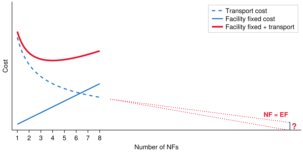
Fig. 13 is what the error does to the decision rather than to a distance. Transport cost falls as facilities are added, facility cost rises, and their sum has the interior minimum the whole problem is about. But the dotted continuation is the unadjusted model’s answer, and it does not level off: it runs to zero at the point where every demand point has its own facility, because at that point every distance in the model is zero. A model that believes this has no reason to stop opening facilities, and its optimum is wherever the fixed cost happens to catch it.
Figure 13: The unadjusted model prices collocation at zero, so its transport cost runs to zero as the number of new facilities approaches the number of existing ones. The interior optimum survives only because the fixed cost rises.
Example 4: Area adjustment on North Carolina ZIPs
Determine how the solution to an uncapacitated facility location problem over North Carolina’s three-digit ZIP codes changes when the area adjustment is applied.
The demand points are the state’s three-digit ZCTAs, weighted by population. Distances are great-circle miles multiplied by a circuity factor of 1.2, the transport rate is one dollar per ten thousand person-miles, and opening a facility costs $7,000.
# Code block 15: North Carolina at three-digit ZIP resolutionz =filter(r ->270<= r.ZCTA3 <=289&& r.POP >0, uszcta3())P, f =hcat(z.LON, z.LAT), float(z.POP)F =repeat(f', length(f), 1)rate, g =1/10_000, 1.2# $/person-mi, circuity factor# One cost per site ($/yr), so ufl takes a scalar, not a vectork =7000;
Solved first with plain great-circle distances, so that every facility serves its own ZIP code for nothing:
# Code block 16: UFL with no area adjustmentD =dists(P, P, :mi) .* gy, TC0, _ =ufl(k, rate .* D .* F; verbose =false) # y = sitesy, TC0 # the assignment itself returns all three
([16, 6, 11, 3, 18], 61301.42207137778)
Then with the adjustment of Eq. 7, which dgca computes from each ZIP code’s land area:
# Code block 17: the same problem, with the area adjustmentDa =dgca(P, P, z.ALAND) .* gya, TCa, _ =ufl(k, rate .* Da .* F; verbose =false)ya, TCa
([16, 5, 6, 11], 71905.73380604858)
# Code block 18: what changedprt(DataFrame(model = ["unadjusted", "area-adjusted"], sites = [length(y), length(ya)], total =round.(Int, [TC0, TCa]), opened = [join(sort(z.ZCTA3[y]), " "),join(sort(z.ZCTA3[ya]), " ")]))
model sites total opened
───────────────────────────────────────────────────
unadjusted 5 61,301 272 275 280 285 287
area-adjusted 4 71,906 274 275 280 285
The adjustment raises total cost by 17.3% and opens 4 facilities where the unadjusted model opens 5.
The cost increase is the part that was expected: the unadjusted model was understating, and correcting it can only push the total up. The changed solution is the part that matters. Had the adjustment only scaled every cost by a constant, the argument for it would be weak, since a location decision is unchanged by a uniform factor. It does not: it changes each demand point by an amount depending on that point’s own area, so it changes both which ZIP codes are worth opening and how many are worth opening at all.
That the total can only rise is worth checking rather than assuming, and it follows from the formula rather than from the run: Eq. 7 takes a maximum with the unadjusted distance, so no distance can decrease, so no cost can. That is a Nudge check, asking whether the answer moved in the direction it had to, with the proof sitting in the equation rather than in intuition. A run that came back cheaper would be evidence of an error, not of a saving.
How much the adjustment matters depends on how coarse the aggregation is, and it is worth knowing which way. Twenty demand points is where it bites: each one stands for a large region, so the distance it hides is large. Push the same problem to a hundred points and then to a thousand and the effect shrinks steadily, because each region is smaller and the distance inside it is a smaller share of the distance between them. At a thousand points, skipping the adjustment changes very little.
That is a threshold rather than a rule, and it joins the two halves of this lecture: the resolution chosen in Sec. 3 determines how much the correction of Sec. 5 is worth. A coarse demand set needs it and a fine one nearly does not, which is another reason the resolution question is not a detail.
Example 5: Aggregate EMCA
Determine how many machines EMCA should lease and where, when its demand points are recognized as aggregates rather than as customers.
Lecture 2.4 solved this instance, and its answer is worth returning to because nothing in it was wrong except the distances. EMCA’s customers were grouped into twenty-eight three-digit ZIP codes, each ZIP’s centroid stood for the customers in it, and every ZIP was both a customer and a candidate site. That is an aggregate demand set by the definition of Sec. 4, solved as though its points were customers, and it is the shape Sec. 6 says a discrete model cannot afford.
The land areas were available the whole time, in the same table the centroids came from, and they are what the earlier solution left on the floor.
# Code block 20: the distance the unadjusted model was giving awayaz = zc.ALAND[iz] # mi^2 of land in each ZIPDz =1.2.*dists(Pz, Pz, :mi) # circuity 1.2, as in lecture 2.4Dza =1.2.*dgca(Pz, Pz, az)own = [Dza[i, i] for i ineachindex(zip)]prt(DataFrame(min_mi =round(minimum(own), digits =1), mean_mi =round(sum(own) /length(own), digits =1), max_mi =round(maximum(own), digits =1)))
A machine placed in a ZIP was serving that ZIP’s own customers over an average of 22.1 miles, and the unadjusted model charged nothing for any of it.
Everything else about the problem is unchanged: the same lease cost, the same rate, the same candidate sites.
# Code block 21: the same lease decision, both waysrton, kz =0.25, 100_000.0# $/ton-mi and $/yr, both givensol(DD) =ufl(kz, (fz .* rton)' .* DD; verbose = false)yz, TCz, _ =sol(Dz)yza, TCza, _ =sol(Dza)prt(DataFrame(model = ["unadjusted", "area-adjusted"], machines = [length(yz), length(yza)], total =round.(Int, [TCz, TCza]), opened = [join(sort(zip[yz]), " "),join(sort(zip[yza]), " ")]))
model machines total opened
─────────────────────────────────────────────────────────────
unadjusted 6 1,248,233 274 275 282 290 294 296
area-adjusted 6 1,467,119 271 275 281 290 294 296
The same 6 machines, at 17.5% more, in 2 different ZIP codes.
The count did not change and the cost did, which is the pattern to expect: the adjustment adds a term that no facility can avoid, so it moves every candidate in the same direction and rarely changes how many are worth opening. Where it bites is on which ones, and it bit here on 2 of 6.
The comparison against Lecture 2.4 is the check, and it is a Landmark. The unadjusted row reproduces 2.4’s Ex. 3 exactly, on data rebuilt from the problem statement rather than carried over, which is what makes the adjusted row believable: the two rows differ in one input and nothing else. A run whose unadjusted column had come back different would mean the demand set had been rebuilt wrongly, and the adjusted answer would say nothing at all.
7. Data wrangling
Data wrangling is not just cleaning data. It is doing whatever is necessary to get data into a form that can actually be worked with. DataFrames operates on tabular data, but an array is often the more convenient representation, and tabular form is typically not the most efficient one, so how the data is laid out is a real choice rather than a default. The larger difficulty is not layout but content: data that comes from outside is routinely missing values or carrying wrong ones.
Tabular data
Most data wrangling tools are designed to operate on tabular data:
Cell = Values: The raw data represented in the table are the values in each cell of the table. Some cells may be missing data.
Columns = Variables: Each column of the table represents a different attribute of the data, represented as a different variable.
Rows = Observations: Each row of the table represents all of the values of the attributes of a single entity represented as a different observation.
Array vs. tabular representations
Three variables: var1 with possible values {A,B}; var2 with values {a,b}; var3 with values {1,2,3,4}:
Array:
a
b
A
1
2
B
3
4
Table:
var1
var2
var3
A
a
1
A
b
2
B
a
3
B
b
4
Array representation is very concise and often used to efficiently represent data for up to three variables, but it can be hard to manipulate for more than three variables. For example, the three variables needed to represent a network (i,j,w) can be represented as an adjacency matrix array (using an efficient sparse matrix) as compared to using a tabular arc list representation. For more than three variables, it is easier to manipulate tabular data; for example, if a new variable, var4, needs to be added in the example above, only another column needs to be added to the table, while the array would need to become 3-D.
Table joins and the split-apply-combine strategy
In data wrangling, table joins are used to combine two datasets based on a common column (like a shared SKU or ID). The split-apply-combine strategy is a common approach in which the data is first split into groups (e.g., by SKU), a calculation is applied to each group (like summing quantities), and the results are then combined into a summary table.
This strategy uses the function groupby to split the data in the table, and then apply a function to each group of split data, and then combines the result into a new dataframe using combine.
Ex. 2 was this pattern, before it had a name. groupby split the three-digit ZCTAs by their first two digits, combine applied a sum to each group’s population and land area and wcentroid to its coordinates, and the result came back as one row per two-digit ZIP.
Joining tables: Sometimes, information is spread across multiple tables. For example, the current table may list SKUs and quantities, but not include item details like weight or cube. To bring in that additional information, a join is used to combine it with another table that contains those attributes. An inner join combines only the rows with matching SKUs in both tables (this is called an “inner” join because it keeps only the overlapping part of the two tables).
Missing data: drop vs. skip vs. impute
Typically, large tabular datasets are available in CSV (comma separated value) format, which is how the income data of Sec. 8 arrives.
For various reasons, some cells in a table may be missing data. In Julia, missing data can be identified with the type missing. All subsequent results that use the missing data will themselves be identified as missing and the data type of the column will be the union of missing and the type of the non-missing data (e.g., Union{missing, Int64}) and the type of column in a data frame will include ? (e.g., Int64?); as a result, it is necessary to either remove, skip, or replace the missing data:
Drop: remove any observations (rows) that contain cells with missing data (e.g., dropmissing(df)).
Skip: if possible, process data while skipping any missing values during calculations (e.g., mean(skipmissing(df.QTY)) computes the mean without removing rows).
Impute: replacing any cells with missing data with a representative value (e.g., coalesce.(df.QTY, mean(skipmissing(df.QTY))) replaces missing values with the average).
For large data sets with few missing values, any missing data is typically dropped or skipped; for smaller data sets, where the missing data occur in columns containing relatively unimportant variables, it may be possible to provide a reasonable value to replace the missing cell (i.e., impute a value). For example, for numerical values, the replacement value could be the average of the non-missing values for the same variable; for categorical values, the replacement value could be the most likely or mode value of the non-missing values.
None of this has been necessary so far, and that is worth noticing rather than enjoying. Logjam’s tables have already been cleaned, so a demand set drawn from them can be selected and used directly, with no missing values in any column that matters. Data from anywhere else is not like that. Values go missing, and what is present is often the wrong type, an integer arriving as a string. Real data essentially never comes ready to use; it almost always needs cleaning first.
8. Joining other data to a demand set
Every demand set so far has been weighted by population, because population is what the census tables carry. They also carry area, and coordinates, and the codes that tie one geography to another, and that is where they stop. It is a basic geographic and demographic picture, and it is bare bones.
Consider locating a luxury goods store. The right place is not where the most people are but where the most money is, and per-capita income is not in Logjam. So the question this section answers is a general one: given a demand set drawn from the census tables, how is other data attached to it?
The answer is a join, and the whole difficulty is in the key. Two tables join only if they agree on a column, and the census publishes its geography in one coding scheme while an external source publishes its data in another. So the work divides in three: select the demand set, get the external data into a usable state, and construct the key that ties them together.
Example 6: Per-capita income across the Raleigh CSA
Determine a demand set of census tracts covering the Raleigh-Durham-Cary combined statistical area, carrying per-capita income alongside population.
Example 6(a): Drilling from the CSA to its tracts
Determine the census tracts belonging to the Raleigh CSA, by descending the statistical-area hierarchy of Sec. 2.
The hierarchy is the route. A CSA is composed of CBSAs, a CBSA of counties, and a county of tracts, and each Logjam table carries the code of the level above it, so each step is one filter. The CSA is found by name rather than by number, because its official name is not something worth remembering:
CSA NAME
──────────────────────────────
450 Raleigh-Durham-Cary, NC
# Code block 23: CSA to CBSA to county to census tractcbsa =filter(r -> !ismissing(r.CSA) && r.CSA in csa.CSA, uscbsa())co =filter(r -> !ismissing(r.CBSA) && r.CBSA in cbsa.CBSA, uscounty())tr =filter(r -> r.STFIP in co.STFIP && r.COFIP in co.COFIP,uscentract());
Two of these filters guard against a missing value, and one does not. A CBSA need not belong to any CSA, and a county need not belong to any CBSA, so both of those columns hold missing for the units that stand alone; a tract always belongs to a county, so no such guard is needed there.
# Code block 24: how many units at each levelprt(DataFrame(level = ["CSA", "CBSA", "county", "tract"], units =nrow.([csa, cbsa, co, tr]), population =sum.([csa.POP, cbsa.POP, co.POP, tr.POP])))
level units population
───────────────────────────
CSA 1 2,242,324
CBSA 5 2,242,324
county 10 2,242,324
tract 490 2,242,324
The population column is a check, and it is the same one Ex. 2 used. One area becomes five, then ten, then several hundred, and the population is identical at every level. It has to be: the drill partitions the same ground four ways. A discrepancy would mean a unit had been lost or double-counted at some step, which is exactly what a filter written against the wrong code produces. That is a Balance check.
Example 6(b): Reading and cleaning the income file
Determine a table of per-capita income by census tract from the published American Community Survey file, in a state fit to join.
Per-capita income is not in Logjam and has to be fetched. The Census Bureau publishes it as table B19301 of the American Community Survey, downloaded here as a CSV of every census tract in North Carolina.5
The file needs three repairs before it can be used, and each is representative rather than peculiar to this file. First, it carries two header rows: the machine-readable column codes, then a human-readable description of each. Read naively, the second row lands in the data and every column comes back as text, so the read skips to line 3. Second, the geographic identifier is prefixed with 1400000US, a summary-level code that no other table carries, so it will match nothing until it is removed. Third, the income column arrives under its ACS code, B19301_001E, which is not a name anything downstream should have to know.
# Code block 25: the ACS per-capita income fileinc =DataFrame(CSV.File("data/ACSDT5Y2022.B19301-Data.csv", skipto =3))inc.GEO_ID =replace.(inc.GEO_ID, r"1400000US"=>"")rename!(inc, names(inc)[3] =>:INCOME)prt(first(inc[!, [:GEO_ID, :INCOME]], 3))
GEO_ID INCOME
─────────────────────
37001020100 36384
37001020200 16999
37001020301 19562
The income column is still text, and that is the fourth repair. Converting it fails, and the reason it fails is the point:
# Code block 26: the values that are not numbersbad =filter(r ->tryparse(Int, r.INCOME) ===nothing, inc)prt(DataFrame(value =unique(bad.INCOME), rows = [count(==(v), bad.INCOME) for v inunique(bad.INCOME)]))
value rows
─────────────
- 23
null 2
A published federal data set contains 25 rows whose income is not a number. They are not corrupt: a tract with almost no residents has no meaningful per-capita income, and the survey records that as a suppressed value rather than inventing one. This is what Sec. 7 called missing data arriving as the wrong type, and the Drop treatment is the right one here, since a tract with no income figure carries no information to impute from.
# Code block 27: keep the rows that parse, then parse theminc =filter(r ->tryparse(Int, r.INCOME) !==nothing, inc)inc.INCOME =parse.(Int, inc.INCOME)
Determine the joined demand set, and account for every tract the join fails to reach.
The two tables now describe the same tracts and share no column. Logjam splits the identifier into its three parts, STFIP, COFIP and TRFIP, while the ACS concatenates them into one string; the key is built by putting Logjam’s back together in the ACS’s format, zero-padded to two, three and six digits.
# Code block 28: build the join key, then join on ittr.GEO_ID =string.(tr.STFIP, pad =2) .*string.(tr.COFIP, pad =3) .*string.(tr.TRFIP, pad =6)trinc =leftjoin(tr, inc[!, [:GEO_ID, :INCOME]], on =:GEO_ID);
A left join keeps every row of the left table whether or not the right table has a match, filling the missing side with missing. That is the deliberate choice: an inner join would keep only the matched tracts and silently discard the rest, and what failed to match is exactly what needs looking at.
# Code block 29: the tracts the join did not reachnomatch =filter(r ->ismissing(r.INCOME), trinc)prt(nomatch[!, [:GEO_ID, :POP, :ALAND]])
GEO_ID POP ALAND
─────────────────────────
37063980100 9 8.10
37183980100 2 7.24
# Code block 30: the finished demand settrinc =dropmissing(trinc, :INCOME)prt(DataFrame(tracts =nrow(trinc), population =sum(trinc.POP), income_lo =minimum(trinc.INCOME), income_hi =maximum(trinc.INCOME)))
tracts population income_lo income_hi
───────────────────────────────────────────
1 488 2,242,313 1,124 114,620
488 census tracts carrying 2242313 people, each with a per-capita income between $1124 and $114620.
The 2 tracts that failed to match were worth looking at rather than counting. Both are the suppressed rows of part (b), holding 9 and 2 people. Dropping them costs 11 residents out of 2242313, which is a Bounds check on the decision to drop: the treatment is defensible because the quantity it discards is bounded and negligible. Had the unmatched rows held a hundred thousand people, the same code would have run and the answer would have been wrong.
Example 6(d): What the new weight buys
Determine how the single-facility minisum optimum for the CSA moves when demand is weighted by total income rather than by population.
The demand set now carries two candidate weights, and the choice between them is the modeling decision the whole exercise was for. Weighting by population locates for the most people; weighting by each tract’s population times its per-capita income locates for the most money, which is what the luxury-goods store wants. Both are the minisum of Lecture 2.2, differing only in the weight vector.
# Code block 32: where each weighting landsprt(DataFrame(weight = ["population", "total income"], nearest = [lonlat2loc(xpop, usplace()).desc,lonlat2loc(xinc, usplace()).desc]))
weight nearest
─────────────────────────────────────
population 5.2 mi E of Cary, NC
total income 4.6 mi NE of Cary, NC
The two optima lie 1.42 miles apart.
A mile and a half is a small movement, and reporting it honestly is more useful than dressing it up. It is small for the reason Ex. 1 gave: the minisum objective is shallow near its optimum, so even a substantial reweighting moves a single facility very little. What changed is not the answer but what the model is able to ask. Nothing in Logjam’s tables could have posed this question at all, and the answer to it now takes two lines.
Endnotes
The Census Bureau’s combined statistical area map, from which the hierarchy in this section is taken: CSA Wall Map, March 2020.↩︎
U.S. Census Bureau, Combined Statistical Areas of the United States and Puerto Rico, wall map, July 2023. Two details from it: the Carolinas-Georgia panel and the legend. Vector PDF at www2.census.gov, accessed 5 September 2026.↩︎
The exact average distance from an arbitrary point to a uniformly distributed point in a disk is collected in R. E. Stone, “Some Average Distance Results,” Transportation Science25(1), February 1991, pp. 83–91: eq. (16) for a point inside the circle and eq. (24) for one outside it. The centroid case is in R. C. Larson and A. R. Odoni, Urban Operations Research, Prentice-Hall, 1981, table 3-1; the exterior result restates S. Eilon, C. D. T. Watson-Gandy and N. Christofides, Distribution Management, Hafner, 1971, formula 8.2, whose earliest form is N. Christofides and S. Eilon, “Expected distances in distribution problems,” Operational Research Quarterly20, 1969, pp. 437–443.↩︎
A. M. Mathai, An Introduction to Geometrical Probability, Gordon and Breach, 1999, p. 207, eq. 2.3.68.↩︎
U.S. Census Bureau, American Community Survey 5-year estimates, table B19301, Per Capita Income in the Past 12 Months (in 2022 Inflation-Adjusted Dollars), 2018-2022, all census tracts in North Carolina. Downloaded from data.census.gov and shipped with this lecture as data/ACSDT5Y2022.B19301-Data.csv.↩︎